Posts

Showing posts from March, 2017

Homework: Blending Images
Image
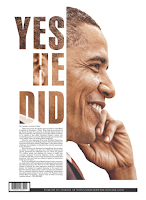
The image on the left is an example of the text filled with an image technique. The technique is commonly used in order to enhance the overall design of the medium. in this case the way in which the technique enhances the overall design is by creating an image which is more pleasing to the eye; it creates a better flow. if the image had a regular text such as a black filled text then it would seem that Obama's head was cut off very abruptly. however with the image also filling the text your eye moves from the text directly to the rest of the image of Obama. a drawback of this example is that the bottom part of the D is difficult to see because it blends with the white background. the example of the technique on the right is a much better way to combine an image and text than if there were to be text on top of the image. if the technique was not used the boat would not be seen and the text would be seen as  a nuisance. with the use of the technique it creates a better overall d

WBL: Workshop: Resumes

Image
today I was fortunate enough to gain some new knowledge about how to apply for a job or internship. before this workshop my knowledge of resumes was that it was basically a summary of who you are and this is supposed to persuade the employer to hire you. Now I know that a lot more though is to be given when writing your resume. a basic resume s to contain your personal information such as: your name, address, phone number, and email(must be a professional email, not one you made in the sixth grade). one thing that did surprise me was that apparently there is supposed to be a cover letter attached to the resume and this is because in the actual letter you are attempting to persuade to persuade the employer to hire you by discussing why your interested in working for the company, why your skills are relevant to the work, and how you will be valuable asset. then in the actual resume you list your skills, work experience, volunteer activities and service organization experience, and educa

Lab 10: How to Print Spreads

Image
this was a very small and simple lab that sole purpose was for us to know how to be able to print in the form of a booklet. this was important because our project that we are currently working on requires to be in a form of a booklet since it will be a miniature yearbook. to complete this lab I first created four spreads in InDesign to mimic what the yearbook would be like. then I number the pages by using master page and placing a text box in either corner of the page. then you place a specific place marker which would be the current page number. the next step was to write my name and place a shape on each spread so that they cross on to both pages. the actual only major difference was the settings you put when printing the booklet; you have to put the pages in landscape, short edge binding, and in this case scale to fit because the digital image would not fit in a letter sized paper. afterwards we printed it and had a real booklet that we created. sample booklet (forgot to take a

Ten80 Trip

Image
This Friday, Saturday the 3rd of March there was a Ten80 Expo which I was fortunate enough to participate in. This expo was with a partnership with the US Army in order to give students from STEM High Schools a chance to experience the different jobs in the US Army that incorporate STEM in one way or other. there were six different courses you could've taken which were code, race, lead, pitch, test, and game. I originally want to participate in either game or test but i ended up going to race which turned out to be one of the better courses. But before everyone split up there was sort of a seminar in which people form STEM field jobs talked about their work and students such as myself could ask question if we were interested. Next each course went to a separate section of the college and my course which was race went inside a room which had a race track set up for toy cars. also each table had its on toy car which was a model of the type of cars they would use in drag races but it

Lab9/Project 5: Brochure

Image
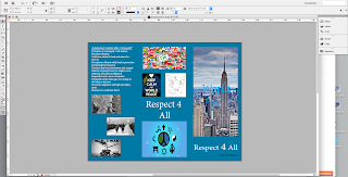
 In this lab/project the objective was to create our own brochure for Respect For All week. To complete this activity we used Adobe InDesign CS6 with the page layout as brochure and have three margins to create a trifold brochure. the topic i chose to write about was world peace because there are a lot of conflict and hatred in this world. The first step was to make an outline of what we wanted our brochure layout to be; no images or text just a very basic design layout. Then we create the digital version of the layout which was just putting text boxes and place holders all around the brochure in the places we wanted the text and images to be. although it wasn't stated we had to research about the topic, i went ahead a did some research about world peace from different sources to see how people viewed it and it gave me ideas of what to write about. however a brochure cannot be just text because the reader will become uninterested; therefore we had to incorporate images to make th