Posts

Showing posts from 2016

Lab8: Editing Tool

Image
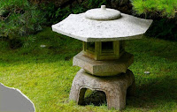
Before In this lab i had to use various editing tools to edit images that contain flaws, which doesn't make it as pleasant. the objective of this lab was to get used to using editing tools to change an image to a desired from in order to make it more appealing to the human eye. In the beginning i had four images that contained a flaw that had to be fixed either using the editing tools. The first image was of a shrine and in the corner was a gray spot and there were two white stones that had to be removed. for this image i had to use the healing brush tool in source mode. before selecting the desired area I first had to select a sample area in order to let the area blend in. to do that you have to click the option button while right clicking on the mouse. afterwards all that is left is to cover the grey parts, but the sample must be similar to the area around the flawed part, so it isn't obvious that it was photo shopped.  Before The next image edited was of a

Lab#7: Image Filters

Image
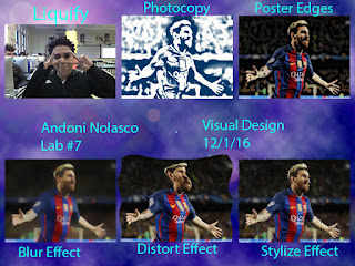
In this lab i had to use different filters to create an effect on the six image that will be made. The objective of this lab was to practice using filter in photoshop to create a specific effect on it that appeals to what you want. To compete this lab i had two different images, one had to be a close up and the other five could be what I choose but it had to be the same image. For the close up I had to use the liquefy filter, but first I had to rasterize the image so the liquefy effect would be available. For three of the images they had to be either the blur, distort, or stylize effect. For the other two I could choose any filter from a specific category in the filter gallery. Then I also added a filter for the background by copying the background layer and in the filter menu click different clouds and then choose the two colors I wanted the clouds to be. Finally I labeled each image with the specific filter I used. This is relevant to Web Design because eventually when we create o

Lab6: Vector Shapes

Image
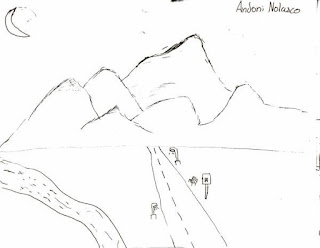
This lab is very similar to lab5, but in this lab we use the shape tool( rectangle tool, rounded rectangle tool, ellipse tool, polygon tool, line tool, and custom shape tool) to re-draw the image. Since the landscape i drew had some smooth edges it was difficult to redraw it using shapes and it ended up like i had some major budget cuts, but i still like it. the objective of this lab was to redraw the image i drew only using shapes, which would lead to it being challenging because there is not enough freedom like in the paint brush tool. The way I did this lab was to first find out what shapes could replace the object that i drew such as triangle could act like the mountains and the rest were mainly created using rectangles. The river i created by using the custom shape tool and selected the page shape and just connected various pages to create a wavy river, also the moon was made using a custom shape tool.     This is relevant to Visual Design because in certain situations it is be

Lab5: Paint Brush Landscape

Image
          For this lab what i did was use the paint brush tool to color in my landscape which i previously drew beforehand. the objective of this lab was for us to experiment using the paint brush tool by using different colors and brushes that create distinct strokes. I completed this lab by first having a drawing of a landscape opened in photoshop, then duplicate the layer so no damage would be done to the original. afterwards, using various colors and brushes color in the image, so it displays my creativity and imagination.         This lab is relevant in Visual Design because knowing your way around a tool it will benefit you in the future. it will make your efficiency better and you would know how to create different effects on the image. in addition with these skills you can be able to create beautiful mages that would appeal to a specific audience and it could be helpful when improving my logo.

Project#2: Collage and Silhouette

Image
The purpose of this project was to create a collage and silhouette for a person of our choosing and the objective was to learn different skills in Photoshop.  First to create the collage I had to make a good selection of the person and inverse the selection so the person's body would not show. next I had to add a layer mask by clicking the add a layer mask button. then all that had to been was add the photos that I had saved previous and place them where I see fit. The way created the silhouette was to first add a sentence that described the person chosen and then selecting the cutout by clicking the picture of the cutout while holding the command button. Afterwards I had to select the sentence I wrote, copy it and go to the paths tab to create a new work path with a tolerance of 1.0. Next, while the type toll is selected click somewhere on the work path and it would automatically create a place to put text because you would see the cursor. The final step was to repeatedly pa

Lab 4: Photography Hike

Image
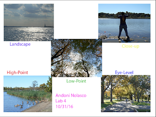
In this lab i used the photos taken from the photography hike from a few weeks earlier to create a sort of collage of different camera angles that are used in the photos. the objective of this lab was for me to refresh my memory of the different camera view points that could be used. the first step to complete this lab was to take a hike will be attentive to what I could take a photo of. for me I chose to go to Flushing Meadows park to take my hike and for most of the morning I walked around taking photos of what I found interesting. afterwards i had to import all the photos from the camera to my computer. then we had to use photos with a high view point, low view point, closeup, landscape, and eye level. those five photos created the image below. This is relevant to Web Design because we must know the different kinds of photos in order to be able to find the best image to use. Each has its strong points that work best in certain situation and we must be able to differentiate the

Project1: Andy Warhol

Image
Project 1: Warhol 1/18/16 Andy Warhol was born on August 6, 1928 and later in life he became a successful magazine and ad illustrator. He also became a leading artist of the 1960’s Pop art movement, pop art was a form of new art that began in the 1950’s in England. It popularized non-academic art by coinciding with pop music and the youth culture boom in the 1960”s. Warhol’s art varied from performance art, filmmaking, video installation to writing. Warhol began silkscreen prints of famous people in 1962 and was obsessed with the goal of becoming rich and famous. Andy Warhol’s art to me is very interesting, so I would want to buy his  artwork because the colors he used are very vibrant like in the Marilyn Monroe portrait.  In my perspective Warhol’s art reminds me of the different sides of a person because the different color combinations almost to me symbolize a person’s characteristics. The association I feel is pleasant because the bright colors u

Lab3: Image Adjustment Part 2

Image
In this lab we took an image of a car and used different image adjustments to make each image be unique in its own way. we had an original image and then four copies of the car and then the image adjustments we used were hue, saturation, color replacements, and black&white. The objective of this lab was to continue practicing using image adjustments, experiment using them, and get used to using different image adjustments. the original image is on the left and the end product with all the adjustments is on the right. The way i did the lab was to first change the image size, so it wouldn't be tiny on the background; therefore, the image size was 250 x 186 in pixels. Then using layer via copy i made four new layers with the car and positioned them so it looked like a staircase. Next using a image adjustments the car on the top left has a black&white adjustments, the one bellow it has a saturation adjustment on it, the next car has its color replaced to purple, and the bott

Lab2: Editing Lancelot

Image
This is the second lab of this year and what we did was edit a picture of Lancelot using different adjustments. the main objective of this lab fro me was to experiment adjusting images in various ways so each one would have something unique about it but this lab has had something else in mind which was to teach us a new way to select an image which was to use edit in quick mask mode. the procedure of this lab was to first select Lancelot; however, we did not use edit in quick mask mode at first, we used whatever tool we wanted. the whole class soon realized how difficult it was to select Lancelot. then we learned about the magic of using edit in quick mask mode because we could then select most of Lancelot with ease without having the blue background ruining the image. After making sure that Lancelot was selected to the best of our abilities I had to make at least eight new layers using layer via copy but these Lancelots had to be smaller than the original Lancelot. this was done by sc

Melon Head Lab

Image
Completing the melon head lab was an amazing experience for me because i have not had previous experience using photoshop or the tool involved in editing something. What i did was created a face using various fruits and then something creative next to it which were birds and a sun out of a grapefruit. Although i have only used three of the tools in the tool bar, it was fun to experiment with the tools and the different ways to use the tool. it gave me an opportunity to see where I'm standing in terms of my photoshop skills and also to let my creativity shine through even though it wasn't very creative but I'm still proud of my accomplishment. the different types of tool i used was the marquee tool, lasso tool, and magic wand tool. then there were subcategories to the tools like the magnetic lasso tool and the rectangular marquee tool. All these tool allowed me to create the following image. The objective of the lab was for me to learn about the different tools that are used

Types of Digital Image File

Image
There are five different types of digital image files which are JNG( also known as JPEG), GIF, PNG, TIF( also known as TIFF), and RAW. The first file, JNG, stands for Joint Photographic Expert Group, which created this standard for this type of image formatting. JPEG files are images that have been compressed to store a lot of information in a small-size file. Most digital cameras store photos in JPEG format, because then you can take more photos on one camera card than you can with other formats. However, some of the image's detail because the file must be compressed to a small size. it is usually used for photographs on the web but are not the best option line drawings, logos, or graphics. GIF stands for Graphic Interchange Format and it compresses images like JNG but it is lossless because no detail in the image is lost. Also GIF cannot make images as small as JNG. GIF can be used for animations or web but is not suitable fro printing or photographs because of the limited colo

What is the difference between Windows and Mac

Image
Although I own a Windows I personally prefer Mac because in my opinion the design and color is much better. In the many years I've own a Windows it has been a process to copy and paste but in Mac there are so many shortcuts that just make life easier. Even though most shortcuts are universal Mac is more compatible with shortcuts unlike Windows. Also the way Mac is outlined seems much brighter and accessible.                                                                                                                Just some ways Macs are better or different than Windows are because Macs tend to focus ore on designs which make it look outstanding, they also have better security since its operating system is built on Unix. Then there are reason why Windows is different than Macd that range from price to hardware. On average Macs tend to be more expensive than Windows because Windows offer some cheaper options unlike Macs. Also if you are into gaming then Windows is b

WHO AM I? WHY AM I HERE?

Image
Im Andoni Nolasco, Im fourteen years old and I live in Corona, Queens. I just came back from a vacation in Mexico and Im just growing used to my new schedule. I enjoy playing soccer after school and my favorite subject is science but the last week has been very hetic with a lot of schedule changes. I was born in Elmurst Hospital but I have been moving between Long Island and Queens basically my whole life. this past year has been ok for me since i did go to Mexico for Summer vacation but as i was over there i had a rough time because my grandfather became an alchohlic and it is worrying my family very much. ive seen this on tv where people dont care what happens to other people or to themselves. this leads to why im here which is because i dont want to become that kind of person. i want my children to look up to me in the future, so im am here now to suceed in this class and in life. this is the first step fro me to have a great and well paying careere that i will enjoy.