Posts

Showing posts from 2017

Newsletter Project

Image
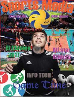
this is the final project of the year and we had to create a class newsletter. in actuality we had groups and each group had to make their own newsletter and in the end a separate group of chief editors is supposed to create a collaborate newsletter with each groups miniature newsletter. the objective of his lab was to create a class newsletter that incorporates each individual newsletter. my group consisted of three people, including myself, and each person had their specific role. but before this project even began, each group member wrote an article and depending on what we wrote about is how we were divided in groups. anyway my role in this project was to create the ads and my article, it was done but I wanted to improve on it even more. Tenzin, another member of the group, worked on the cover and game section of the newspaper and Jason worked on creating a new article because we had overlapping article about el clasico which we couldn't have. for my part of the project specif

SPJ Code of Ethics

Image
the SPJ Code of Ethics is a statement of principles that are supported by explanations and position papers which address changing journalistic practices. although it is not a set of rules, it is a guide that encourages all who engage in journalism to take responsibility for the information that provide. the reason it cannot be a set of rules is because under the First Amendment it cannot be legally enforced. the four principles of the Code of Ethics are journalists should Seek Truth and Report it, Minimize Harm, Act Independently, and Be Accountable and Transparent. the first principle Seek Truth and Report it is because journalism should be accurate and fair. other parts of this principle include that journalist should: "take responsibility for the accuracy of their work, remember that speed and format are not excuses for inaccuracy, provide context, gather/ update and correct information throughout the life of a news story, be cautious when making promises, keep the promises the

YearBook Project

Image
Arguably the hardest project to date because it was the very first group projects. in this yearbook project each group had to create a miniature yearbook specifically for the class. in my opinion the main objective of this project was to see how we would work together as a group; how we would organize and execute the project. since this was a very complex project, a lot of planning had to go first. the very first step each group did was to give each person a role( manager, chief editor, photographer, or content editor) and come up with a theme for the project. I was the manager for my group and the theme for our yearbook was Back in Black. next it was required that we had to create a drat/model of how the design of the yearbook would be; each page, 24 in total, had to be included so everything at least had a plan. then the execution process of creating the project was done, each person had a select number of pages to do and my section was the class photos, projects, and trips. us

Identity Poster

Image
this assignment was done in order to decide who would represent the school in the Graphic Design Competition, and this year the theme for the advertising poster event was identity. so over spring break I had to come up with an idea for the poster that had the identity theme. my idea since the very beginning was to have two sides of the poster: on one side it was either a drawing or picture of a person and on the other side it was to be what identity was or how it was viewed. this idea actually ended up being my final poster; how the final product was created was by first taking the famous Renaissance Man drawn from Leonardo Da Vinci and creating a white mask over one side of the drawing. it starts off completely white so in order to show detail I traced the body lines that were on the Da Vinci original drawing so it would look much more like a human.  on the other side I placed an image portraying binary code inside the drawing. on the other side I placed an image portraying binary co

Lab11: Hw to Fill Text with an Image

Image
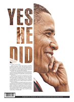
in this quick lab I replaced text with an image, so the image would be exactly the same as the text except the filing of the text is the actual image. there are some points to keep in mind when doing this procedure; one is that the text must be large and the font should be bold. this is because a font which is too small or thin then the image wouldn't be seen easily; therefore, a big and bold font would be optimal to use. the actual procedure after  getting a good font is to create and outline of the text created. to do so you select the text first then in the menu bar go to "Type" and there you will find create outline . next you must place an image by either going to file in the menu bar and clicking place or use the shortcut which is command D. either way the image should be placed inside the text but it may not exactly fit correctly. therefor, to fix this problem easily is by going to object>fitting>fill frame proportionally and the image should fit much bett

Parts of a Newspaper

Image
  some of the major parts of a news paper include: a headline, cut, nameplate, deck, by-line, photo credit, index, cutline, graphic, jump line, and lead. Headline: the title given to a story Cut: a photo or illustration Nameplate/Masthead: a newspaper's name printed in a special type on the front page Deck: a secondary head-line which provides additional info about the story By-Line: name of the writer appearing above the article Photo Credit: a reference to the source of a photograph Index: an alphabetized table of contents f the newspaper Cutline: descriptive info appearing with a piece of "art", also called a caption Graphic: a combination of artwork and words which helps to visually explain a story Jump Line: line telling readers where the story is continued Lead: the first sentence of a news story informing the reader of who, where, what, when and sometimes how and why.

Homework: Blending Images

Image
The image on the left is an example of the text filled with an image technique. The technique is commonly used in order to enhance the overall design of the medium. in this case the way in which the technique enhances the overall design is by creating an image which is more pleasing to the eye; it creates a better flow. if the image had a regular text such as a black filled text then it would seem that Obama's head was cut off very abruptly. however with the image also filling the text your eye moves from the text directly to the rest of the image of Obama. a drawback of this example is that the bottom part of the D is difficult to see because it blends with the white background. the example of the technique on the right is a much better way to combine an image and text than if there were to be text on top of the image. if the technique was not used the boat would not be seen and the text would be seen as  a nuisance. with the use of the technique it creates a better overall d

WBL: Workshop: Resumes

Image
today I was fortunate enough to gain some new knowledge about how to apply for a job or internship. before this workshop my knowledge of resumes was that it was basically a summary of who you are and this is supposed to persuade the employer to hire you. Now I know that a lot more though is to be given when writing your resume. a basic resume s to contain your personal information such as: your name, address, phone number, and email(must be a professional email, not one you made in the sixth grade). one thing that did surprise me was that apparently there is supposed to be a cover letter attached to the resume and this is because in the actual letter you are attempting to persuade to persuade the employer to hire you by discussing why your interested in working for the company, why your skills are relevant to the work, and how you will be valuable asset. then in the actual resume you list your skills, work experience, volunteer activities and service organization experience, and educa

Lab 10: How to Print Spreads

Image
this was a very small and simple lab that sole purpose was for us to know how to be able to print in the form of a booklet. this was important because our project that we are currently working on requires to be in a form of a booklet since it will be a miniature yearbook. to complete this lab I first created four spreads in InDesign to mimic what the yearbook would be like. then I number the pages by using master page and placing a text box in either corner of the page. then you place a specific place marker which would be the current page number. the next step was to write my name and place a shape on each spread so that they cross on to both pages. the actual only major difference was the settings you put when printing the booklet; you have to put the pages in landscape, short edge binding, and in this case scale to fit because the digital image would not fit in a letter sized paper. afterwards we printed it and had a real booklet that we created. sample booklet (forgot to take a

Ten80 Trip

Image
This Friday, Saturday the 3rd of March there was a Ten80 Expo which I was fortunate enough to participate in. This expo was with a partnership with the US Army in order to give students from STEM High Schools a chance to experience the different jobs in the US Army that incorporate STEM in one way or other. there were six different courses you could've taken which were code, race, lead, pitch, test, and game. I originally want to participate in either game or test but i ended up going to race which turned out to be one of the better courses. But before everyone split up there was sort of a seminar in which people form STEM field jobs talked about their work and students such as myself could ask question if we were interested. Next each course went to a separate section of the college and my course which was race went inside a room which had a race track set up for toy cars. also each table had its on toy car which was a model of the type of cars they would use in drag races but it

Lab9/Project 5: Brochure

Image
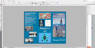
 In this lab/project the objective was to create our own brochure for Respect For All week. To complete this activity we used Adobe InDesign CS6 with the page layout as brochure and have three margins to create a trifold brochure. the topic i chose to write about was world peace because there are a lot of conflict and hatred in this world. The first step was to make an outline of what we wanted our brochure layout to be; no images or text just a very basic design layout. Then we create the digital version of the layout which was just putting text boxes and place holders all around the brochure in the places we wanted the text and images to be. although it wasn't stated we had to research about the topic, i went ahead a did some research about world peace from different sources to see how people viewed it and it gave me ideas of what to write about. however a brochure cannot be just text because the reader will become uninterested; therefore we had to incorporate images to make th

Metropolitan Museum of Art Visit

Image
SuijingÅ« (Shrine of the Water God) Mihrab(prayer niche) lamassu(bull version) lamassu(lion version) This past Friday I went on a trip to the Metropolitan Museum of Art to see different types of art from various time periods. We went on a tour through the museum and the first piece of art worked we looked at was from the Islamic galley and it was called mihrab(prayer niche). the next two artworks was from the Near Eastern Exhibition, they were both lamassus which meant I ancient times they were used to guard the palaces. one of the lamassus was a human-headed winged bull and the other was human-headed winged lion. the next artwork was a rather unique piece called PixCell-Deer#24; it is a real dead deer covered in marble spheres. the fourth artwork on the tour was my personal favorite was SuijingÅ« or Shrine of the Water God. the last two pieces of art were portrayals of the sane person which was John Brown but they were the complete opposite. the first one was named John

CTE Expo

This past Monday I participated in the CTE Expo. It was an entirely new experience for me because i am not used to interviewing people and convincing strangers to join our CTE academy. The whole room had projects from the sophomores, juniors, and seniors in order to give a glimpse of what the freshman should expect if they choose Web Design as their CTE academy. The CTE Expo's is so important in my opinion is because attract freshman to join Web Design in their sophomore year, but it was also an evaluation of how the sophomores could handle an environment where you have to talk to complete strangers and convince them that you are right. I have been in another interview before when I was applying for SEO Scholars. I was nervous then as I was Monday but I had to persevere and talk to freshman I didn't know and interact with them to make them believe that Web Design is the best academy. The professional look we had did give me a little confidence because I felt good, but after

Project4: Business Cards

Image
This project was all about me going through the process of creating my own business card. The main objective of this project was for me to create a professional business card that could have the possibility of being used in the real world. There were some other objectives such as creating my own original logo and getting to know InDesign. The process was quite the tedious one because to start out with a business card you need a logo, but before that you need goals that you would like the logo to achieve such as what you want it to express about yourself or what group of people are being targeted. The second step was for me to create three different logos in Photoshop that were original, expressed originality and meet the goals I wanted my logo to have.  Next was the making of the actual business card which was done in InDesign because I can have the proper format for a business card. It had to include the basic contact information, yet not be basic and plain si

W.B.L Workshop

Image
A few weeks back I took part in  W.B.L.(Work Based Learning) Workshop about working as a young adolescent in high school. I was told about my rights, the dangers of working, how long I can work, and the protection  I have will working. I was unaware of most of the information taught because I have not yet worked for any business that was not family relative. apparently I have the right to be paid fairly for a day's worth of work. also the minimum wage is $7.25 per hour which will become $11 per hour in 2017. other rights include being payed for overtime, the right for a safe workplace, freedom of harassment and discrimination, and I have the right to address ways in which to improve working conditions. Then since I am still under aged I was told about the jobs which I cannot take apart of such as using power tools or mining coal. the most surprising rule told was that if I am a 16 year old in Florida I cannot wrestle an alligator; I mean why would anyone want to do that? Next I w

Project 3: Restore Old Photograph

Image
this project was the process of restoring a damaged photo only using the editing tools. the objective of this lab was to restore the photo to how it would be before all the damage; all the editing was to be done to the " best " of our ability. the way i completed the project was by using the various editing tools in photoshop such as the patch tool, spot healing brush tool, healing brush tool, content awareness tool, and clone stamp tool. By using these tools in various ways you can get rid of most of the damage done over time. The tool i used the most was the healing brush tool and the spot healing brush tool because in my opinion worked the most efficient. Of course it wasn't perfect, if used too much it would just blur the image so it had to be used with caution. To me this was a very useful even though it is very difficult to become acustom to. It is also relevant in Web Design because in nature or anything there will be a flaw and so to be able to correct the flaw i